

You might think that great typography is just about picking a nice font.
(I used to think that too).
But here is the truth:
Good typography isn’t about the font. It’s about the math.
If your website text looks “messy” or hard to read, it’s probably not because you chose the wrong typeface.
It’s because you lack Vertical Rhythm.
In this guide, I’m going to show you exactly how to build a mathematical Typography Scale that looks professional on every device.
And the best part?
You don’t need a degree in graphic design to do it. You just need a calculator.
If you are serious about mastering the fundamentals, you should also check out my comprehensive guide to UI Design Principles where I cover how typography fits into the bigger picture of visual hierarchy.
But for now, let’s fix your fonts.
Chapter 1: What is a Typography Scale?
Imagine building a house.
You wouldn’t use random lengths of wood, right? You would use standard measurements. 2x4s. 4x4s.
A Typography Scale is the exact same thing.
It is a set of limited, pre-defined font sizes that you use across your entire interface.
Instead of picking random sizes like “13px” or “19px” because they look good…
…you stick to a strict mathematical progression.
Why is this important?
Consistency.
When you use a scale, your H1s, H2s, and body text always look like they belong together. It creates a natural harmony that the human eye loves.
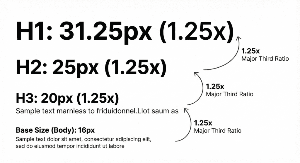
Most scales are based on musical intervals (yes, really).
For example, the “Major Third” scale multiplies the font size by 1.25 at every step.
- Base: 16px
- Step 1: 20px (16 x 1.25)
- Step 2: 25px (20 x 1.25)
- Step 3: 31.25px (25 x 1.25)
See the pattern?
Chapter 2: Choosing Your “Magic Number” (The Ratio)
So, which ratio should you use?
This is where most designers get stuck.
They pick a ratio that is too aggressive (like the Golden Ratio, 1.618), and their headings end up being HUGE.
Or they pick one that is too small, and their headings look just like body text.
Here is my rule of thumb for 2025:
For Mobile: Use a tighter ratio. The Minor Third (1.20) works best.
For Desktop: You have more room. Go for the Major Third (1.25) or the Perfect Fourth (1.333).
The “Golden Ratio” is famous in art, but in UI design? It’s dangerous.
If your base text is 16px, a Golden Ratio scale makes your H1 a massive 110px. That takes up half the screen on a laptop!
Stick to 1.25 (Major Third). It’s the sweet spot between contrast and usability.
Chapter 3: Mastering Vertical Rhythm
Now that we have our sizes, let’s talk about spacing.
This is the secret sauce.
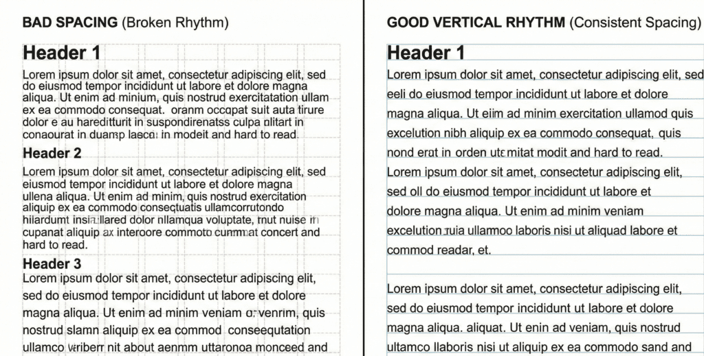
Vertical Rhythm is the practice of keeping the vertical spacing between elements consistent.
Think of your website as a sheet of notebook paper with blue horizontal lines.
Every line of text, every image, and every button should sit perfectly on those lines.
If your “lines” are 24px apart, then everything on your page must use a height that is a multiple of 24px.
- Margin-bottom: 24px
- Image height: 240px (24 x 10)
- Padding: 48px (24 x 2)
When you break this rhythm, the page feels “off.”
When you nail it? The design feels tight, professional, and expensive.
Chapter 4: The Formula (How to Calculate Line Height)
Okay, let’s do some math.
Don’t worry, it’s simple.
To establish Vertical Rhythm, you need to calculate your Base Line Height.
Most browsers default to a line-height of roughly 1.2.
That is way too cramped for modern reading.
For optimal readability, you want a line-height between 1.4 and 1.6 times your font size.
Let’s calculate a 4px Baseline Grid:
- Start with your Base Font Size: Let’s say 16px.
- Multiply by 1.5: 16px * 1.5 = 24px.
Boom. 24px is your magic number.
This means your body text line-height is 24px.
But here is the trick for your Headings:
Your Headings need a tighter line-height (usually 1.1 or 1.2), BUT their final height still needs to fit the grid.
Let’s say your H1 is 48px.
If you use a 1.5 line height, that’s 72px. That’s huge!
Instead, aim for a multiple of your 4px baseline.
- 48px font size + 8px spacing = 56px line height (Divisible by 4).
Always round your line-heights to the nearest multiple of 4.
This ensures that no matter what font size you use, your content always snaps back to the grid.
Chapter 5: Tools to Do the Work for You
Does this sound like a lot of manual math?
It is.
That’s why smart designers don’t do it manually. We use calculators.
Here are the top 3 tools I recommend to generate your scales instantly:
1. Typescale.com This is the industry standard. You pick a base size, pick a ratio, and it spits out the CSS code for you.
2. Gridlover This tool is amazing because it visualizes Vertical Rhythm. You can adjust the line-height slider and watch the text snap to the grid in real-time.
3. Archetype This is for the advanced pros. It helps you create consistent typography systems directly in the browser.
Chapter 6: Responsive Typography (Fluid Scales)
Here is a pro tip that sets the experts apart from the beginners.
Fluid Typography.
On a desktop, a 16px base font is perfect.
But on a massive 27-inch monitor? It looks tiny.
And on a small iPhone SE? It might be too big.
Instead of setting strict breakpoints (e.g., “At 768px, change font to 18px”), use CSS Clamp.
The function looks like this:
font-size: clamp(16px, 2vw, 20px);
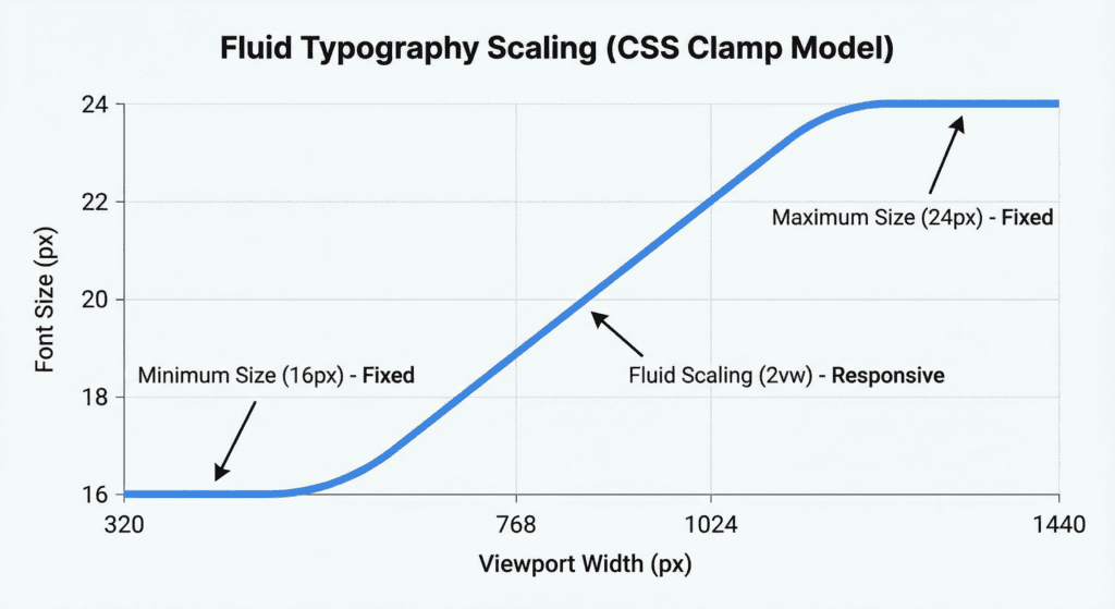
What does this do?
It tells the browser: “Make the font 2vw (2% of the viewport width), but never go smaller than 16px and never go bigger than 20px.”
This creates a perfectly smooth scaling effect. Your specific scale ratio (Major Third) stays intact, but the entire system grows and shrinks with the device.
The Bottom Line
Typography is 95% of the web. If you get the scale and the rhythm right, the rest of the design becomes easy. You don’t need to stress about where to place images or how much padding to use. The grid decides for you.
So, here is your next step: Open up your current project. Check your line-height.
Is it a random number like 1.4? Change it. Make it calculated. Make it fit the grid.