

The difference between a “good” app and a “great” app isn’t usually the features.
It’s the details.
It’s the satisfying “pop” sound when you send a message. It’s the way a button morphs into a loading spinner so you know something is happening.
These are Microinteractions.
And in 2025, they are not just “eye candy.” They are essential for usability.
Dan Saffer, the author of Microinteractions, said it best:
“The details are not the details. They make the design.”
A bad microinteraction creates friction. It confuses the user. A good one creates delight and provides instant system feedback.
In this guide, we are going to look at 10 real-world examples of Bad vs. Good microinteractions.
We will break down exactly why they fail (or succeed) so you can fix them in your own projects.
Let’s get into the examples.
Note: If you are new to the concept of user feedback, read the “Interaction Design” section in my Comprehensive Guide to UI Design Principles first
1. The Submit Button (Loading State)
We have all been there.
You click “Submit” on a form… and nothing happens.
So you click it again. And again.
Suddenly, you have submitted the payment three times and charged your credit card triple.
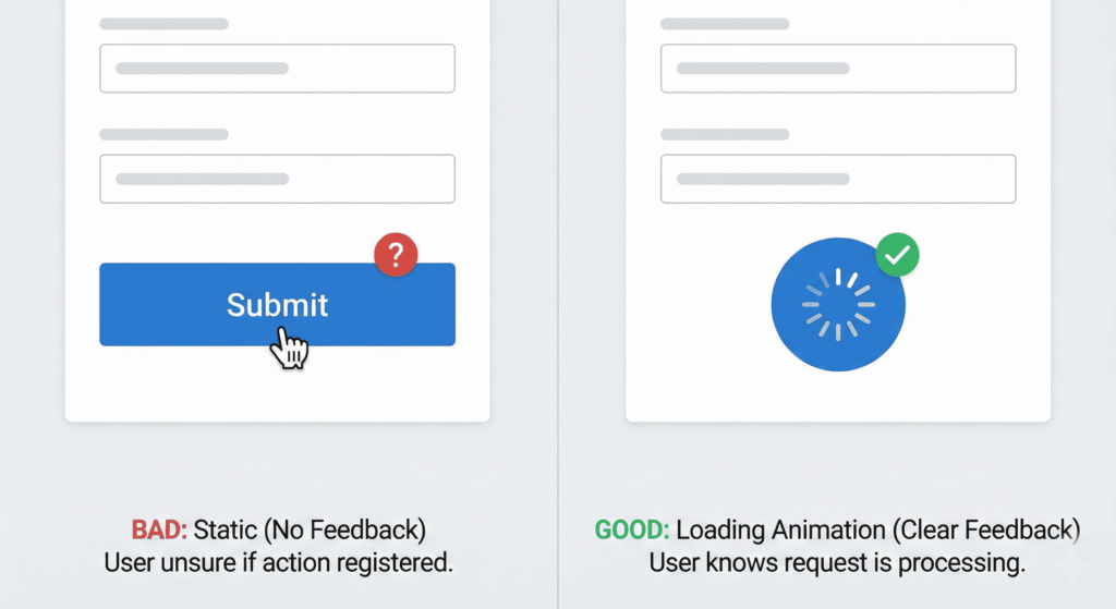
Bad Microinteraction
The button stays static after clicking. The user has no idea if the request was sent or if the internet connection died. This causes Rage Clicking.
Good Microinteraction
The moment the user clicks, the button morphs into a loading spinner. When the action is done, it turns into a green checkmark or says “Sent!”
Why it works: It provides immediate confirmation (System Status) that the click was registered.
2. Password Visibility (Show/Hide)
Typing a long password on a mobile phone is a nightmare. One typo, and you have to delete the whole thing and start over.
Bad Microinteraction
A plain text field masked with dots (•••••••) with no option to view it. Users have to guess if they typed “P@ssword” or “P@sw0rd”.
Good Microinteraction
Including a toggle icon (usually an Eye) inside the input field. When clicked, the dots transform into readable text.
Why it works: It gives control back to the user and reduces error rates on login forms.
3. The Toggle Switch (On/Off)
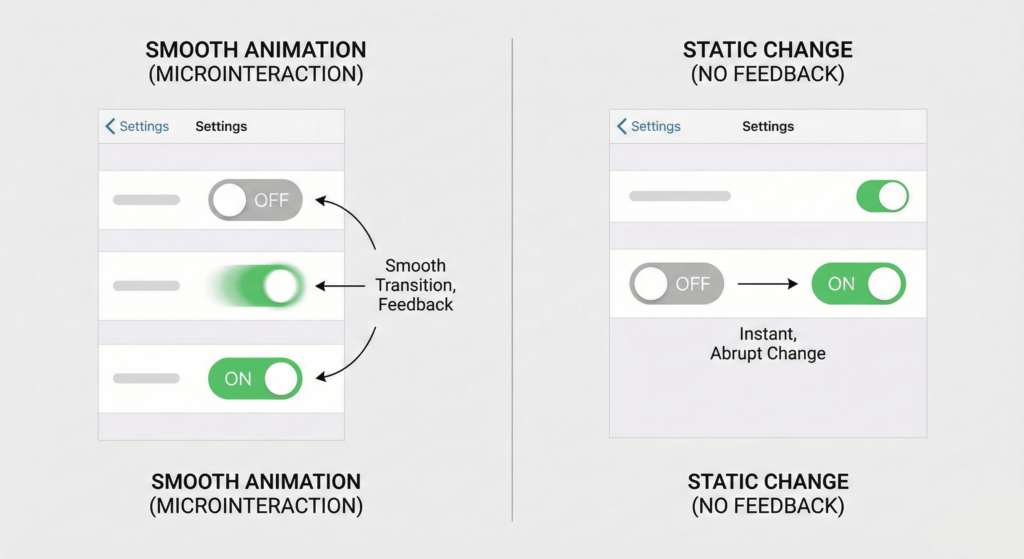
Toggles are everywhere in modern UI (especially in Settings menus).
Bad Microinteraction
When clicked, the switch changes color instantly (e.g., Grey to Green) with zero movement. It feels robotic and cheap. It relies solely on color, which is bad for colorblind users.
Good Microinteraction
The circle (thumb) physically slides from left to right. The background color fades in smoothly.
Why it works: It mimics a real-world physical switch. The movement reinforces the action of “turning something on.”
4. "Pull to Refresh"
This gesture was invented by Twitter (now X) and is now a standard mobile pattern.
Bad Microinteraction
The user pulls down, and the screen just freezes while loading. Or worse, a generic browser spinner appears.
Good Microinteraction
As the user pulls down, an icon (such as an arrow or bubble) expands. When they release, it snaps back with a satisfying “bounce” animation while the data loads.
Why it works: It utilizes Elasticity. It directly links the user’s physical finger movements to the interface, making the app feel responsive and fluid.
5. Input Validation (Forms)
Forms are the most boring part of the web. Don’t make them painful.
Bad Microinteraction
The user fills out 10 fields. They hit submit. Then the page reloads and shouts: “ERROR: Field 3 is invalid.” This is frustrating and forces the user to recall what they did.
Good Microinteraction
Inline Validation. The moment the user finishes typing an email address, a small green checkmark appears next to the field. If they miss the “@” symbol, a gentle red message appears immediately.
Why it works: It prevents errors before they happen (a key principle of Nielsen’s Heuristics).
6. "Add to Cart" Confirmation
In E-commerce, this is the money maker.
Bad Microinteraction
The user clicks “Add to Cart.” The page refreshes. Or a tiny number in the top corner changes from “0” to “1”. The user often asks: “Did that work?”
Good Microinteraction
When clicked, the button creates a visual trail. A small image of the product “flies” from the button into the cart icon at the top of the screen. The cart icon shakes or pulses to “catch” the item.
Why it works: It visually connects the action (buying) to the result (cart). It is satisfying and encourages more shopping.
Lorem ipsum dolor sit amet, consectetur adipiscing elit. Ut elit tellus, luctus nec ullamcorper mattis, pulvinar dapibus leo.
7. The Like Button (Twitter/Instagram)
The “Heart” button is the most clicked element on social media.
Bad Microinteraction
Clicking the heart simply turns the outline red. Boring.
Good Microinteraction
Particle Explosion. When clicked, the heart doesn’t just turn red. It bounces. Small confetti or particles explode outward. Twitter’s heart animation is a famous example of this.
Why it works: It gamifies the interaction. It rewards the user for engaging with the content by giving them a tiny dopamine hit.
8. File Upload Progress
Uploading large files is anxiety-inducing. “Is it stuck? Did it freeze?”
Bad Microinteraction
A static text saying “Uploading…” or an indefinite spinner that just loops forever.
Good Microinteraction
A linear progress bar that fills up from 0% to 100%. Bonus points if you include:
Estimated time remaining.
Current speed (MB/s).
A “Complete” animation at the end.
Why it works: It removes uncertainty. It reduces the user’s perception of waiting time (Psychology of Waiting Lines).
9. The Hamburger Menu Transition
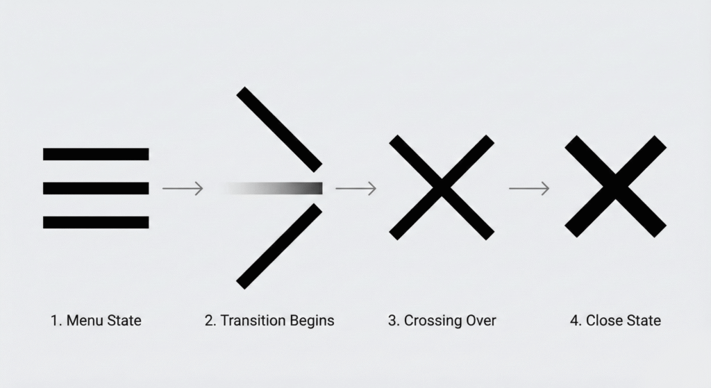
The dreaded 3-line menu icon.
Bad Microinteraction
You click the hamburger icon. The menu instantly appears (cuts) on the screen. The icon remains 3 lines. To close it, you have to find a separate “X” button.
Good Microinteraction
When clicked, the 3 lines smoothly morph into an “X”. The menu slides in from the side. When clicked again, the “X” morphs back into the 3 lines.
Why it works: It maintains context. It shows the user that the “Open” button has now become the “Close” button.
10. Empty States (404 or No Data)
Sometimes, things go wrong. Or the user just has no data yet.
Bad Microinteraction
A blank white screen. Or a generic text saying “No results found.” This feels like a dead end.
Good Microinteraction
A whimsical illustration (maybe a ghost or a sleeping cat). A playful microcopy: “It’s quiet in here…” And most importantly: A button guiding them to do something else (e.g., “Create your first post”).
Why it works: It turns a negative moment into a neutral or positive one. It keeps the user in the flow rather than letting them bounce.
How to Build These (Tools for 2025)
You might be thinking: “I’m not an animator. How do I code this?”
In 2025, you don’t need to write complex JavaScript for this.
Here are the standard tools:
LottieFiles: The gold standard. You export animations from After Effects as JSON files, and they run natively on Web, iOS, and Android. They are vector-based and tiny in size.
Rive: The new competitor to Lottie. It allows for interactive animations that respond to cursor position.
CSS Keyframes: For simple things like Hover states, Toggles, and Button loaders, pure CSS is best for performance.
Frequently Asked Questions (FAQs)
Do microinteractions slow down my website?
Not if implemented correctly. In the past, heavy GIFs or videos caused lag. However, in 2025, we use lightweight tools like Lottie (JSON) or pure CSS animations. These are vector-based and extremely small in file size, meaning they load instantly without affecting your site speed.
What is the best tool to create microinteractions?
For simple animations (like buttons or hovers), CSS is best. For complex animations (like a “Like” explosion or custom loaders), LottieFiles and Rive are the industry standards. They allow you to export animations from After Effects directly to code.
Are microinteractions bad for accessibility?
They can be if they are too flashy. To ensure accessibility, always avoid rapid flashing (which can trigger seizures) and respect the user’s device settings. You can use the CSS media query @media (prefers-reduced-motion) to automatically disable animations for users who have requested less motion.
What is the difference between a microinteraction and an animation?
All microinteractions involve animation, but not all animations are microinteractions. A microinteraction is functional, and it provides feedback or helps a user complete a task (e.g., a toggle switch). A decorative animation is just for looks.
Final Word
Microinteractions are the handshake of your digital product.
If the handshake is limp and weak (Bad UI), the user won’t trust you. If the handshake is firm and confident (Good UI), you build a connection.
Your Challenge:
Go through your app today. Find ONE static element. Maybe it’s your “Subscribe” button. Maybe it’s your form error messages.
Add a microinteraction to it. Make it move. Make it speak.
Trust me, your users will notice.
Which of these 10 examples do you hate the most on other websites?