

You stare at the color picker for hours. You try a hundred different shades of blue. But somehow? It still looks “off.” It looks messy. It looks amateur. Don’t worry, you are not alone. Even senior designers struggle with this.
There is a “secret weapon” that interior designers have been using for decades to fix this exact problem. And now, the world’s best product designers are using it to build apps you love. It’s called: The 60-30-10 Color Rule.
By using this simple mathematical framework, you can stop guessing and start designing. In fact, maintaining color consistency can increase brand recognition by up to 80%. This rule is a critical piece of the visual hierarchy puzzle. (If you want to understand the full scope of creating great interfaces, you should check out my Comprehensive Guide to UI Design Principles.
But for today, we are going to master color.
In this guide, I’m going to show you exactly how to use the 60-30-10 rule, analyze real-world examples, and even show you when to break the rule.
Let’s dive in.
Chapter 1: What Actually is the 60-30-10 Rule?
Simply put, it is a balancing act.
The human brain craves order. When a design has too many competing colors, it creates “visual noise.”
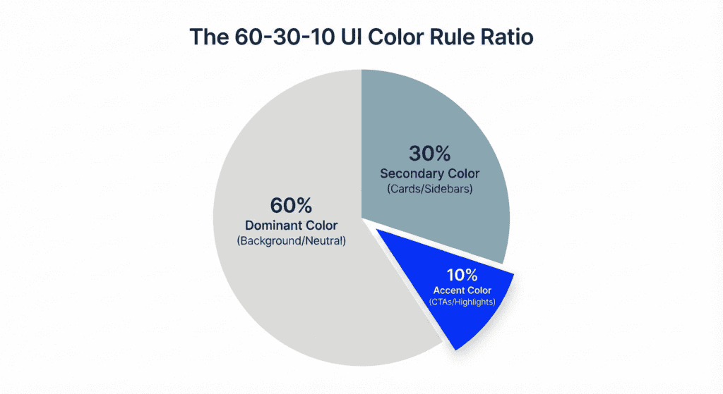
If you are asking what is the 60 30 10 rule, it is a classic decor principle shifted into the digital space to create harmony by limiting your palette to three distinct roles.
The 60 30 10 rule brings harmony by limiting your palette to three distinct roles. Here is the formula: Here is the formula:
- 60% is your Dominant Color.
- 30% is your Secondary Color.
- 10% is your Accent Color.
This ratio ensures that users know exactly where to look. It creates a natural hierarchy that guides the eye comfortably across the screen. Implementing the 60 30 10 rule ui design ensures that your interface doesn’t overwhelm the user.
It works for everything. Whether you are designing a sleek SaaS dashboard, a mobile app, or even applying the 60 30 10 rule character design for brand mascots, the math remains the same.
Chapter 2: The Breakdown (Where to Apply Each Color)
Knowing the percentages is one thing.
Knowing where to put them is another. If you mess up the application, you end up with a website that looks like a circus.
Mastering the 60-30-10 rule ui design requires understanding that these proportions are about visual weight, not just surface area. Let’s break down exactly how to apply this to a standard web interface.
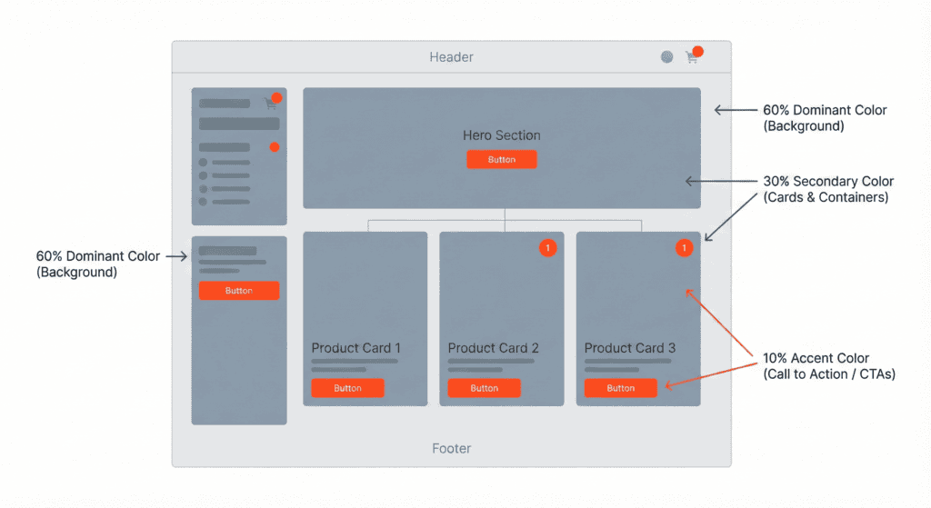
1. 60% – The Dominant Color (The Canvas)
This is your foundation.
In UI design, the Dominant Color is almost always your background.
- Neutrality is key. In 2025, this is usually pure white (#FFFFFF), a very light gray (#F5F5F7), or deep charcoal (#121212) for dark mode.
- The goal: To make the other elements pop.
When using the 60 30 10 design rule, this large portion acts as the “quiet” space that allows your content to breathe. Think of an art gallery. The walls are white so that the art grabs your attention. Your 60% is the wall.
2. 30% – The Secondary Color (The Structure)
This color supports the dominant color but is distinct enough to create Contrast.
It creates the “furniture” of your website.
You should use this for:
- Cards and Containers.
- Sidebars and Navigation Menus.
- Headers and Footers.
- Secondary text or subtitles.
It shouldn’t be too bright. It should feel related to the background but visibly separate.
3. 10% – The Accent Color (The Call to Action)
This is where the magic happens.
This 10% is reserved for the most critical actions on your page.
- Primary Buttons (CTAs).
- Active Links.
- Notification Badges.
- Progress Bars.
This color should be vibrant. It should contrast heavily against both the 60% and the 30%.
When a user squints at your screen, the 10% elements should be the first things they see.
Chapter 3: Real-World Case Studies (Seeing is Believing)
Okay, that’s the theory.
But does this actually work in the wild? Let’s analyze two apps you probably use every day. You might not have noticed the math, but your brain definitely did. These examples prove that the 60-30-10 color rule web design is the industry standard for high-converting, aesthetic platforms.
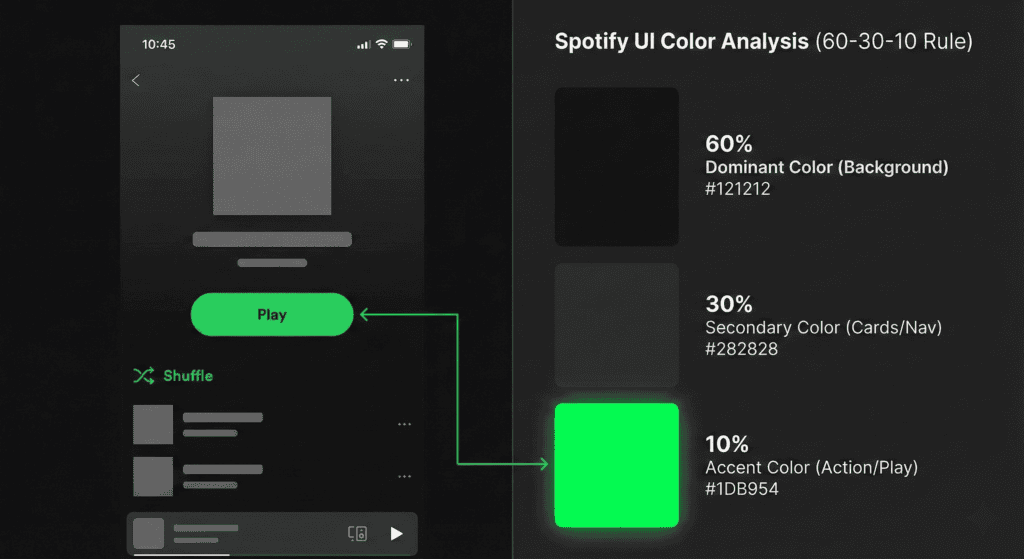
Case Study 1: Spotify (Dark Mode Excellence)
Spotify is a masterclass in the 60-30-10 rule.
- 60% (Dominant): Pitch Black / Dark Grey Background. This sets the mood.
- 30% (Secondary): Lighter Grey. Used for album art placeholders, sidebars, and player controls.
- 10% (Accent): Spotify Green.
Notice how rarely they use that Green?
It is ONLY used for the “Play” button and active toggles. Because it is used so sparingly, your eye goes directly to it.
Case Study 2: Facebook (The Classic Blue)
Facebook (Desktop version) is another perfect example.
- 60% (Dominant): Light Grey Background (The canvas).
- 30% (Secondary): White (The cards, the posts, the sidebar containers).
- 10% (Accent): Facebook Blue.
They use Blue for the logo, the primary icons, and the “Post” button.
If Facebook made their background blue, it would be overwhelming. By sticking to the rule, the interface feels clean and navigable.
Chapter 4: Tools to Automate the Process
“This sounds great, but I’m bad at picking colors.” I hear you.
The good news is that you don’t have to pick them manually. There are AI tools that can generate a 60 30 10 color rule web design palette for you in seconds, ensuring your colors are mathematically balanced before you even start the layout.
Here are my top 3 recommendations for 2025:
1. Adobe Color (The Professional Choice)
Go to the “Explore” tab and type in a mood like “Modern Tech” or “Organic.” Adobe will give you 5-color palettes. Just pick the three strongest ones to fit your ratio. This is a great way to achieve math fact mastery over your color distributions without needing a degree in color theory.
2. Material.io (The Scientist)
Google’s Material Design tool has a built-in color generator. You pick one primary color, and it automatically calculates the secondary and background colors that are scientifically proven to look good together.
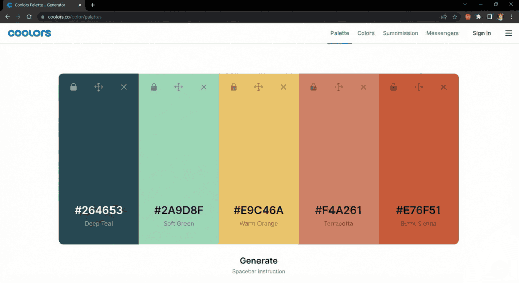
3. Coolors.co (The Rapid Fire)
This is my personal favorite. Press the spacebar to generate random palettes. Lock the color you like, and keep pressing space until you find your perfect 60, 30, and 10.
Chapter 5: What if I Need More Colors? (The 60-30-5-5 Exception)
This is the most common question I get:
“What if my brand has TWO accent colors?”
Or what if you need a “Success” color (Green) and an “Error” color (Red)?
Does the rule break? Nope. You just adapt it.
Welcome to the 60-30-5-5 Rule.
In this scenario, you take your 10% Accent bucket and split it in half.
- 5% for your Primary Action (e.g., Blue for “Submit”).
- 5% for your Secondary Action (e.g., Red for “Delete”).
The Trap to Avoid: Do NOT make it 60-20-20.
If you have two accent colors fighting for attention (20% each), you lose the hierarchy. Neither button will stand out.
Keep the accents small. They are spices, not the main course.
Chapter 6: Accessibility & Contrast (The “Invisible” Rule)
You can have the most beautiful 60-30-10 palette in the world…
…but if people can’t read it, it is worthless.
In 2025, Accessibility (a11y) is not optional. It is a requirement.
When applying the 60-30-10 rule, you must check the Contrast Ratios between your colors.
The Golden Numbers (WCAG 2.1)
- Text on Background: Must have a ratio of at least 4.5:1.
- Large Text / Icons: Must have a ratio of 3:1.
Common Mistake: A lot of designers use a light grey text (30%) on a white background (60%). It looks “minimalist” on a Retina MacBook. But on a cheap monitor in a sunlit room? It is invisible.
The Fix: Always check your palette using a tool like the WebAIM Contrast Checker before you finalize your design.
If your 10% accent color is Yellow, and your background is White, you cannot use white text inside the yellow button. The contrast ratio is too low You must use black text.
Final Word
The 60 30 10 rule graphic design professionals swear by is not a restriction. It is a liberation. It frees you from the anxiety of the blank canvas. It gives you a roadmap to follow so you can focus on what matters: the user experience.
So, here is your challenge for today: Open up your current project (or even just your portfolio site) and audit the colors.
- Is your background taking up 60%?
- Are your cards distinct?
- Is your accent color screaming for attention, or is it drowning in noise?
Tweak the ratios. Simplify the palette. You will see the difference instantly. Now, I’d love to know: Which tool are you going to use to generate your next palette? Adobe Color or Coolors?