

If you want to master UI Design Principles in 2025, you’re in the right place.
Because this guide isn’t just about making things look “pretty.” It’s about creating interfaces that actually convert.
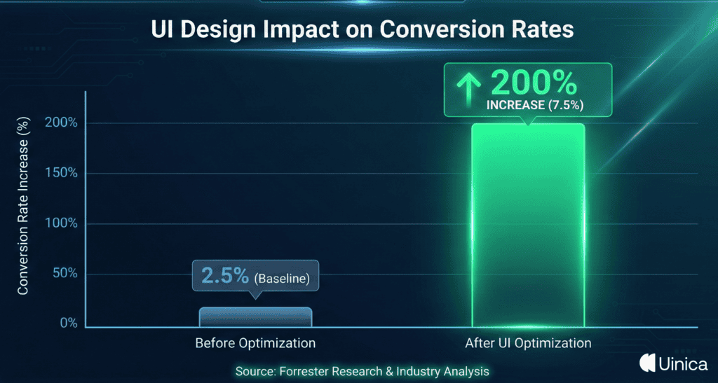
In fact, a recent report by Forrester revealed that a well-designed user interface can increase your website’s conversion rate by up to 200%.
That is insane. But here is the problem:
Most design guides are just a boring list of academic theories. Or they recycle the same old advice from 10 years ago.
Not this one. I’ve tested, analyzed, and broken down the 21 most critical principles into actionable strategies. Strategies that you can use on your next project immediately.
From visual hierarchy to cognitive psychology. I’m covering everything you need to know to build products that users love. So if you’re ready to go beyond the basics.
And start designing like a senior pro. Let’s dive right in.
Chapter 1: The "Golden Rules": Nielsen’s Heuristics Remastered
When it comes to UI Design, Jakob Nielsen is basically the Godfather.
Back in the 90s, he developed 10 Usability Heuristics for User Interface Design. And guess what? They are still the gold standard today.
But here is the catch:
The original definitions are a bit… academic.
So I’ve remastered the most critical ones for 2025. These are the foundational pillars that hold up every great app and website.
Let’s break them down.
Visibility of System Status (The "Are We There Yet?" Rule)
You press the button for the 10th floor. But the button doesn’t light up. And the floor numbers don’t change.
You would probably panic, right?
That is exactly how users feel when your interface doesn’t give them feedback.
Visibility of System Status simply means keeping users informed about what is going on, through appropriate feedback within a reasonable time.
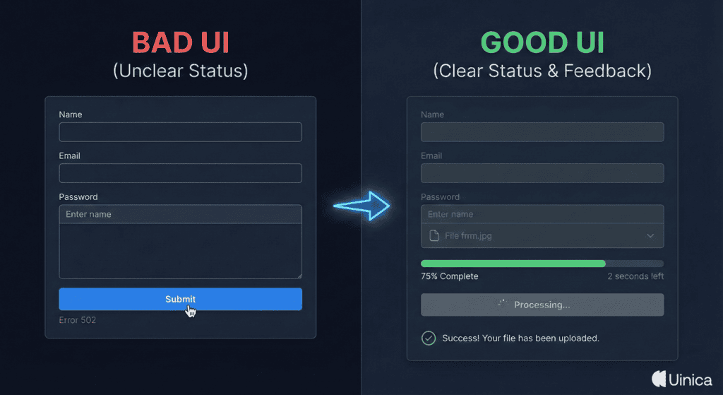
If a user clicks “Submit,” show a spinner.
If a file is uploading, show a progress bar.
This principle is vital because it builds trust. It tells the user: “Don’t worry, I got this.”
According to research by the Nielsen Norman Group, talking about response time and providing immediate feedback (under 0.1 seconds) makes the user feel like the system is reacting instantaneously. Anything longer than 1 second requires a loading animation to keep the user’s attention.
Match Between System and the Real World
You want your UI to speak the user’s language.
Not “System Error 404: Database Connection Failed.”
But “Oops! We couldn’t find that page.”
This principle is all about using words, phrases, and concepts familiar to the user, rather than internal jargon.
Think about the “Trash Can” icon on your desktop.
It works because it mimics a real-world object. You know exactly what it does without reading a manual.
This is often called a Mental Model.
Users bring their existing knowledge of the physical world into the digital world. If your UI matches that mental model, the learning curve drops to zero.
So, avoid terms like “Execute” or “Terminate.” Use “Start” or “Stop.”
User Control and Freedom (The Undo Button)
We all make mistakes.
(I make at least 5 typos before breakfast).
And when users make mistakes on your site, they need a clearly marked “emergency exit.”
This is where User Control and Freedom comes in.
This principle dictates that you should support Undo and Redo functions.
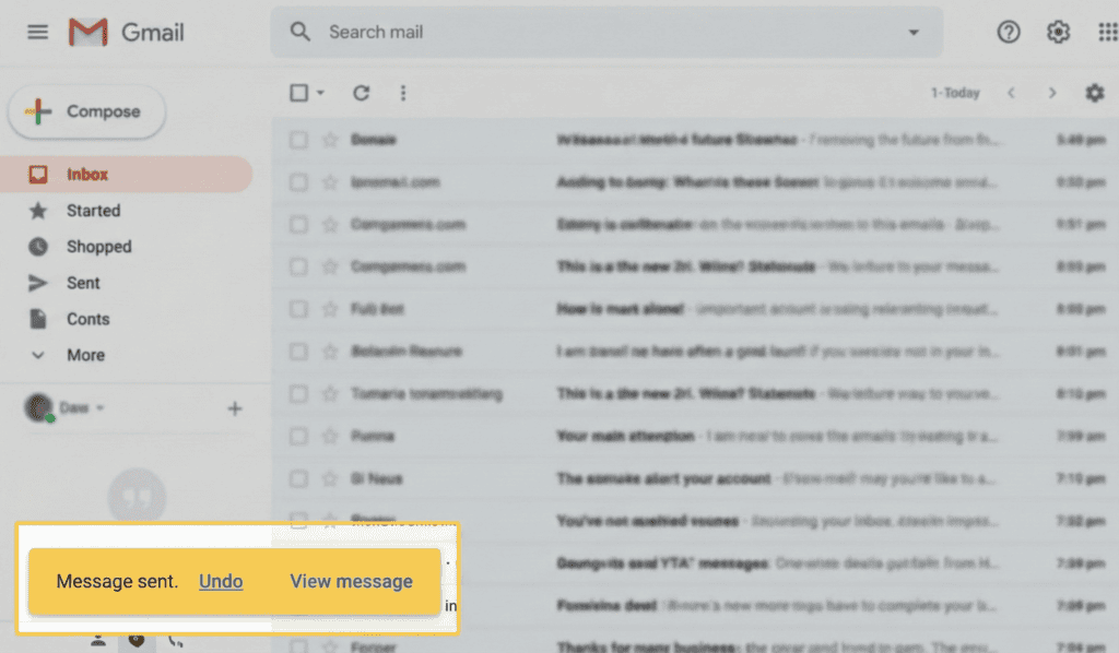
A perfect example? Gmail’s “Undo Send.”
That little popup has saved millions of careers.
If a user accidentally deletes a project, don’t just delete it. Give them a “soft delete” with a way to restore it.
Why is this so important?
Because when users know they can reverse an action, they feel more confident exploring your interface. They aren’t afraid to click buttons.
Consistency and Standards (Jakob’s Law)
Here is a truth that might hurt your ego:
Users spend most of their time on other sites.
This is known as Jakob’s Law.
This means that users prefer your site to work the same way as all the other sites they already know.
If every ecommerce site puts the shopping cart in the top right corner…
…you should put your shopping cart in the top right corner.
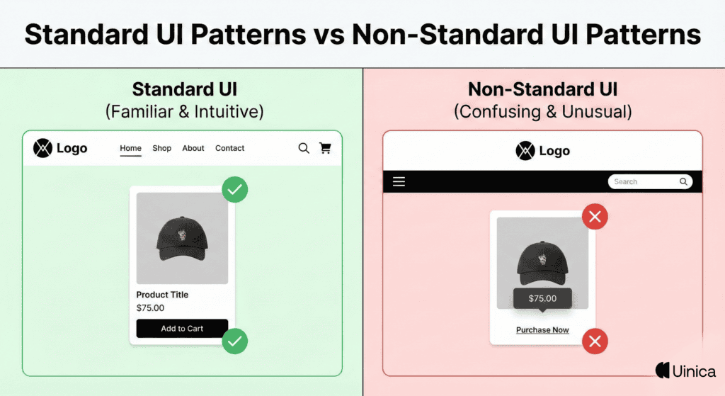
Don’t try to be clever with standard patterns.
If you reinvent the wheel for basic navigation, you are just forcing users to relearn how to browse the web. And that creates massive Cognitive Load.
Stick to the standards for the basics (Navigation, Search, Buttons). Save your creativity for the content and the branding.
Chapter 2: Visual Hierarchy & Aesthetics
Now that we have covered the foundational rules…
Let’s talk about aesthetics.
But this isn’t just about making things look “pretty.”
It’s about guiding the user’s eye.
Visual Hierarchy is the backbone of intuitive UI. It tells the user what’s important and what they should do next.
Without it, your users are flying blind.
Here is how to master it.
The 60-30-10 Color Rule
Picking colors is hard.
The 60-30-10 rule makes it easy.
It’s a timeless interior design principle that works perfectly for UI.
Here is the breakdown:
60% is your dominant color. This is usually your background (white or dark gray).
30% is your secondary color. This is for cards, sidebars, or headers.
10% is your accent color. This is reserved exclusively for CTAs (Call to Action) and key buttons.
This simple ratio ensures balance.
It prevents your UI from looking like a rainbow exploded. By limiting your accent color to 10%, you ensure that your most important buttons pop off the screen.
Typography Scales & Vertical Rhythm
Typography is 90% of UI design.
Seriously.
If people can’t read your content easily, they won’t use your product.
But don’t just pick random font sizes. You need a Typography Scale.
This is a mathematical sequence of font sizes (like 16px, 24px, 32px, 48px). Using a scale creates natural harmony across your design.
And don’t forget Vertical Rhythm.
This is the vertical spacing between lines and paragraphs.
A good rule of thumb? Set your line-height to roughly 1.5x the font size for body copy. This makes long blocks of text breathe and significantly improves readability.
The Power of White Space (Negative Space)
Beginners fear white space. Pros embrace it.
White space (or Negative Space) is the empty area between design elements.
It’s not “wasted space.” It is a crucial design tool.
Think of it as the silence between musical notes. Without it, you just have noise.
Studies show that proper use of white space improves reading comprehension by up to 20%.
It reduces Cognitive Load and forces the user to focus on the elements that actually matter.
If you want users to notice something, don’t make it bigger. Just put more empty space around it.
See what Mr. Kenlee, Ux generalist, says about Why Cognitive Load Matters for UX Designers.
Contrast Ratios & Accessibility (WCAG Compliance)
Designing for accessibility isn’t just the “nice” thing to do.
It’s essential. And in many jurisdictions, it’s the law.
A huge part of accessibility is Contrast Ratio. This is the difference in brightness between foreground text and the background color.
If you put light gray text on a white background, it might look “sleek” on your 4K monitor. But you are alienating millions of users with vision impairments.
The WCAG 2.1 guidelines state you need a minimum ratio of 4.5:1 for normal text.
Don’t guess. Use a tool like the WebAIM contrast checker to ensure your text is readable by everyone.
Chapter 3: Cognitive Psychology & UX Laws
You might think you are just designing a screen.
But you are actually designing for the human brain.
The best UI designers are part artists, part psychologists. They understand Mental Models and how our brains process information.
If you ignore these laws, your users will feel “tired” using your app without knowing why.
Here are the 4 psychological principles that rule the web.
Hick’s Law (Minimizing Cognitive Load)
Ever stared at a Netflix menu for 20 minutes and picked nothing?
That’s Hick’s Law in action.
It states: “The time it takes to make a decision increases with the number and complexity of choices.”
In other words: More options = More confusion.
If you bombard users with 10 different buttons, they will likely click zero.
The fix? Simplify.
Break complex tasks into smaller steps. Use “Wizard” interfaces for long forms.
Limit your navigation menu to 5-7 items max.
By reducing the choices, you reduce the Cognitive Load and speed up the user’s decision-making process.
Fitts’s Law (Optimizing Touch Targets)
This one is simple but powerful.
Fitts’s Law dictates that the time required to move to a target area is a function of the distance to the target and the size of the target.
Translation?
Make important buttons BIG.
And put them where they are easy to reach.
This is crucial for mobile design.
If a “Buy Now” button is tiny and tucked away in the top corner, conversion rates will tank.
Make your primary CTAs full-width on mobile. And ensure they are at least 44×44 pixels (the minimum recommended touch target size by Apple).
The Aesthetic-Usability Effect
First impressions matter.
The Aesthetic-Usability Effect describes a phenomenon where users perceive attractive products as more usable.
It’s true.
If your UI looks polished and modern, users will be more forgiving of minor usability issues.
But if your site looks like it was built in 1998?
Users will assume it’s broken, insecure, or buggy—even if the code is perfect.
This is why “ugly but functional” is a myth in 2025. Trust is built through visual quality.
Miller’s Law (Chunking Content)
The average human can only hold about 7 (plus or minus 2) items in their working memory.
This is Miller’s Law.
This is why phone numbers are broken into chunks (555-867-5309) rather than one long string (5558675309).
In UI design, we call this Chunking.
Don’t present a user with a wall of text or a form with 20 fields.
Group related information together.
Use clear headings.
Break long credit card numbers into groups of four.
By chunking content, you make it digestible. You stop the user’s brain from being overwhelmed.
Chapter 4: Interaction Design & Feedback
Static screens are boring.
Great UI is alive. It responds to you.
It acknowledges your every click, scroll, and hover.
This is Interaction Design.
It’s the bridge between the user and the code. And when done right, it makes your app feel like a natural extension of the user’s hand.
Here is how to create that “magic” feel.
Microinteractions & Haptic Feedback
You know that satisfying “pop” sound when you send a message?
Or the way the “Like” button on Twitter creates a little explosion of hearts?
Those are Microinteractions.
They are small, subtle animations that provide immediate feedback. They tell the user: “Action received.”
Don’t ignore them.
Without microinteractions, an app feels dead.
And for mobile? Use Haptic Feedback.
That tiny vibration when you successfully complete a task adds a physical dimension to your digital UI. It creates a sensory experience that users love (even if they don’t consciously notice it).
Affordance (Make Buttons Look Clickable)
This is a classic design trap.
Designers love “flat” design. But sometimes, they make things too flat.
If your button looks just like a text label…
…no one is going to click it.
Affordance refers to the visual clues that tell a user how to interact with an object.
A door handle “affords” pulling. A button with a shadow “affords” pushing.
Don’t make users guess.
If something is clickable, make it look clickable.
Use shadows, borders, or distinct colors to separate interactive elements from static content.
If users have to hover over text just to see if it’s a link, your UI has failed.
Error Prevention (Before It Happens)
You know what’s better than a good error message?
No error message at all.
Error Prevention is about designing your interface to stop users from making mistakes in the first place.
Think about a date picker.
If you ask users to type a date manually (DD/MM/YYYY), half of them will type it wrong.
But if you give them a calendar dropdown? It is impossible to make a formatting error.
Another great example is Google Search.
When you start typing a typo, it suggests the correct spelling immediately.
Use constraints. Disable the “Submit” button until the form is filled out correctly.
Be proactive, not reactive.
Recognition Rather Than Recall
Pop quiz:
What is the command line code to open a folder in Linux?
Unless you are a developer, you probably don’t know.
But if I showed you a folder icon on a desktop, you would know exactly what to do.
That is the difference between Recall (remembering from memory) and Recognition (recognizing cues).
Recognition is always easier.
Your UI should minimize the user’s memory load.
Don’t ask users to remember ID numbers or codes from the previous page.
Show them their browsing history. Use icons with labels. Keep menu options visible.
The less the user has to remember, the smoother their experience will be.
Chapter 5: Modern UI Standards (2025 Edition)
The web looked very different 10 years ago.
(Remember Flash player? Yikes).
And in 2025, the game has changed again.
We aren’t just designing for desktops anymore. We are designing for foldable phones, smartwatches, and 4K retina displays.
If you want your UI to feel “current,” you need to adopt these modern standards.
Mobile-First & Thumb Zone Architecture
Here is a wild stat:
Over 58% of all web traffic comes from mobile devices.
If you are designing for desktop first, you are doing it backwards.
You need to design for the Thumb Zone.
Research by Steven Hoober found that 75% of users interact with their phone using only one thumb.
This means the top of the screen is “No Man’s Land.” It’s hard to reach.
The bottom center? That is prime real estate.
This is why modern apps (like Spotify or Instagram) have moved their navigation bars to the bottom.
Place your most important actions (Search, Home, Cart) within easy reach of the user’s thumb.
Dark Mode & Theming Support
Dark mode isn’t just a trend.
It’s a user expectation.
It saves battery life on OLED screens. It reduces eye strain at night. And let’s be honest: it looks cool.
But don’t just invert your colors and call it a day.
True Dark Mode requires careful semantic color selection.
Pro Tip: Avoid pure black (#000000).
Pure black can cause “smearing” on scrolling text on some screens. Use a dark grey (like #121212) instead.
Also, use the CSS prefers-color-scheme media query. This allows your site to automatically switch themes based on the user’s system settings.
It feels like magic.
Ethical Design (Avoiding Dark Patterns)
For years, growth hackers used Dark Patterns to trick users.
Things like:
Hiding the “Unsubscribe” button.
Sneaking items into a shopping cart.
Fake countdown timers.
In 2025? Users are savvy. They hate this stuff.
And Google hates it too.
Ethical Design is about transparency.
If a user wants to cancel their subscription, let them.
If you use cookies, be clear about it.
Respecting the user creates long-term loyalty. Tricking them creates short-term gains and long-term churn.
Be the good guy.
Skeleton Screens vs. Spinners
Nobody likes waiting.
But if your app has to load data, how you handle that wait matters.
The old way? A spinning wheel of death.
The modern way? Skeleton Screens.
These are blank versions of your page that pulse with a subtle grey animation while content loads.
Why are they better?
They make the app feel faster.
This is called Perceived Performance.
A spinner draws attention to the fact that the user is waiting. A skeleton screen shows progress and layout, making the wait feel shorter.
It’s a small psychological trick that huge companies like LinkedIn and Facebook use to keep you engaged.
Final word
Mastering UI design doesn’t happen overnight. But it is the single best investment you can make for your product. Because at the end of the day, your interface is your product.
It doesn’t matter how good your backend code is if users can’t figure out how to use it.
By applying these 21 principles from the “Golden Rules” to modern 2025 standards you are doing more than just moving pixels.
You are creating experiences that feel seamless, intuitive, and human. You are removing friction and building trust. And that is the real secret to outranking your competitors.
Now it’s your turn. Don’t just bookmark this guide. Pick one principle. Fix one screen. Start small.